Getting into SunPy
Attempting Pull Request: Spectrogram log y axis #291
I'm love spectra. So, when the GSoC process required that I dive into issues in the open source Python library SunPy, I looked for something regarding spectra. I'm still getting used to GitHub, though, so attempting to change the code of such a large and utilized library is kind of intimidating. Then, I found the pull request linked above using a spectrogram... Great! I have low resolution data that I can use to test this!
As it turns out, this class is still being developed. I also realized that a spectrogram is slightly different than the spectra I've been working with so far.
A spectrogram show a spectrum of frequencies as they vary with time. It is used to visualize sounds plotted with time on the x axis and frequency on the y axis. This is different, but closely related to a spectra or spectrum of light that I am accustomed to, where frequencies (or wavelengths) are plotted on the x axis and the amount of of light (or flux) is plotted on the y axis. This means that I probably shouldn't try to test it with my visual range spectra. Instead, this is most likely working with radio frequencies.
This makes sense for solar data. Radio bursts from the corona are observed, and need to be analysed.
Getting Started:
I found the code needing to be tested. On first glance, I noticed that the spectrogram class has a plot definition, and thought that a simple 'logy' keyword and an if statement added in the plot definition would suffice, like this:if logy:
ax.yscale('log')
I need to test this though, and started with loading in the module and inserting a basic 2D array of random data:
>>> import spectrogram
>>> import numpy as np
>>> data = np.ndarray((10,10), buffer = np.array(np.random.random(100)))
>>> freq_axis = np.linespace(30, 300, 10)
>>> time_axis = np.array(range(0, 10, 1))
Then, I set up some arbitrary start and end times (10 seconds) to suffice the keywords:
>>> import datetime
>>> start = datetime.datetime(2016, 2, 2, 12, 30, 30)
>>> end = datetime.datetime(2016, 2, 2, 12, 30, 40)
Put it all together:
>>> gram = spectrogram.Spectrogram(data, time_axis, freq_axis, start, end)
And, just like that I have a spectrogram object. Next, to test the plot function:
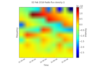
>>> gram.plot()
Colorful! Now, let's try this with my addition if statement:
>>> gram.plot(logy=True)
This flopped with many, many errors. and it is not showing a a frequency range. So, I think my data may not be in the right format.
I tried it again, this time with making a sine wave with 10 being the sampling rate.
>>> sine = np.sin(2 * np.pi * (3*10**4) * (np.arange(100)) / 10)
>>> data2 = np.ndarray((10,10), buffer=sine)
>>> gram2 = spectrogram.Spectrogram(data2, time_axis, freq_axis, start, end)
It produces:
Looking less like noise. But, still not making a frequency axis. I'm going to look for data to use so that I can reproduce the use of this module, and then add my changes to test the log y axis change.
***


No comments:
Post a Comment